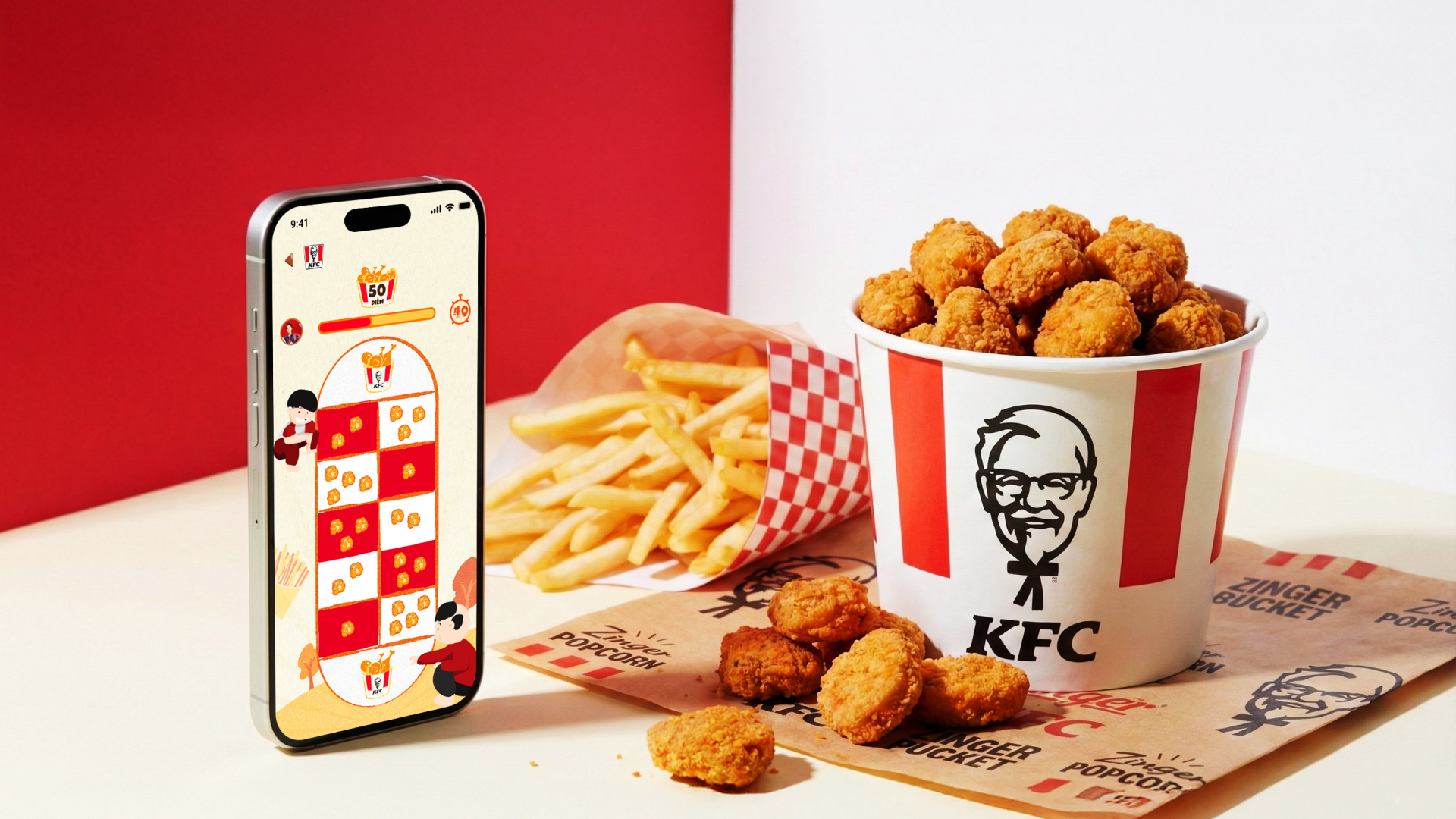
Loading the portfolio

Loading page assets

KFC INTERACTIVE AR CAMPAIGN

The unique combination of gamification and augmented reality (AR) delivers an emotional and highly interactive experience.

KFC Campaign

KFC interactive AR game displayed on a phone beside fries and a KFC bucket.

Background.

KFC is one of the most recognized fast food chains in Vietnam with over 200 stores nationwide. During the highly competitive summer season, the brand wanted to deepen its emotional connection with Gen Z consumers. However, their passive physical touchpoints, like receipts and food packaging, were generating very little digital engagement.

Problem.

Traditional loyalty campaigns often rely on boring discount codes that fail to create excitement or repeat visits. KFC needed a fresh solution that could bridge the gap between their physical stores and digital channels. Most importantly, it had to work instantly without forcing users to download a separate new app.

Project Objectives.

  • Increase repeat store visits through a fun and gamified reward system.
  • Create a smooth physical to digital bridge across 222 stores in 64 provinces.
  • Allow users to access the experience in seconds with absolutely zero friction.

Goal.

Design a frictionless phygital campaign that smoothly connects KFC's physical stores with a digital experience. We aimed to increase repeat visits and boost Gen Z engagement through a fun and culturally familiar mini game on Zalo. The ultimate objective was to turn passive buyers into active players without requiring them to download any new applications.

Challenge.

Design for a Gen Z audience with a very low tolerance for friction. The experience had to launch in seconds right after scanning a QR code, which meant zero onboarding time was allowed. We also had to seamlessly connect multiple touchpoints including physical receipts, AR filters, Zalo mini games, and a reward redemption system into one continuous and trustworthy user journey.

My Role.

Product Designer

Contribution.

  • UX Research
  • Design System
  • UI/Visual Design
  • Prototyping

Outcome.

This campaign transformed passive in-store touchpoints into an immediate digital engagement loop. By removing entry friction and using familiar local gameplay, we turned receipt scans into repeat participation and measurable campaign outcomes.

116,719+

QR code scans

QR Engagement

12,378

visits

Top Game: Ô Ăn Quan

10%

for top game Ô Ăn Quan

Interaction Rate

< 30%

across all stages

Drop-off Rate

1.8×

attempts per user

Scan Efficiency

42,148+

users joined

Mini-Game Participation

30,549+

prizes distributed

Rewards Claimed

63%

were females aged 24 - 34

Audience Profile

Design Process.

Based on real merchant requirements and common operational scenarios.

Planning

Define ProblemsFind Solutions

UX Design

WireframeUser Flow

UI & Interaction

Visual DesignMicro-Interactions

Prototype Testing

PrototypeUser Testing
KFC interface collage showing the main campaign home screen.
KFC interface collage showing instruction and task screens.
KFC interface collage showing mini game screens.
KFC interface collage showing reward and result screens.

User Research.

To understand what Gen Z actually wants from a summer campaign, I combined user interviews with behavioral data from past KFC campaigns. We also looked deeply into the technical capabilities of Zalo Mini Apps to ensure our design ideas were actually possible to build.

Methodology

  1. User Interviews & Surveys: Conducted quick interviews with Gen Z users in Vietnam to understand their digital behaviors, game preferences, and expectations during summer campaigns
  2. Behavioral Analysis: Reviewed engagement patterns from previous KFC digital activations to identify drop-off points and high-friction moments
  3. Platform Research: Analyzed Zalo Mini App capabilities and constraints to align UX decisions with technical feasibility from the start

User Archetypes

KFC Gen Z user archetypes and persona insights.

The Insight

The Three Step Rule

Users made one thing very clear during our research. Their ideal experience is simply scan, play, and win in three steps maximum. The moment an experience requires more than two taps just to understand the rules, they lose interest quickly.

Zero Friction Entry

This finding led to our main design implication. We needed to meet users exactly where they are right on Zalo. The experience had to launch in seconds with absolutely no explanation needed to keep them engaged.

Ideation & Strategy

Our Guiding Principles.

How might we design a frictionless experience that transforms a simple KFC receipt into an interactive brand moment that Gen Z users actually want to replay and share?

Zero Friction Entry

Every second between scanning and playing costs us users. The AR filter must launch immediately. No registration walls. No long tutorials.

Cultural Familiarity

The game mechanics should feel instantly recognizable to Vietnamese users. This reduces the cognitive load and increases the replay rate.

Reward Transparency

Users need to clearly see how to earn and claim their rewards. Hidden rules break user trust and kill conversion rates.

Concept Exploration

We brainstormed several game mechanics, including matching puzzles and rhythm games. Ultimately, we selected Ô Ăn Quan, a traditional Vietnamese board game. We chose this because it required zero explanation for local users, while still allowing for score-based competition and high replay value.

Campaign Flow.

Campaign flow from scanning the receipt to playing the mini game and claiming rewards.

Gameplay Flow.

Gameplay flow showing scan, landing, game selection, play, result, and reward redemption.

Ideation

Here, I sketched the key pages including the landing, gameplay, lucky spin wheel, and others. The goal was to explore different ideas with wireframes.

Wireframe ideation board showing the key KFC campaign pages and flows.

Iteration

For this campaign, we went through multiple design cycles to make sure the game was not just functional but genuinely fun to play. After testing our initial concepts, we realized the experience felt a bit too quiet for a summer campaign. We needed to turn up the energy while keeping the interface easy to use on small screens.

Iteration showcase with refined KFC campaign screens displayed inside a framed presentation card.

Final Solution.

The final product is a seamless loop. It starts with a physical action in the store and transitions smoothly into a digital Zalo mini game. I focused heavily on using KFC red as the primary color to drive instant brand recognition, combined with minimal game UI so the interface never blocks the actual gameplay.

High-Fidelity Prototype

I turned my mockups into a prototype that's ready for testing, using gestures and motion, which can help enrich the user experience and increase the usability of the app.

Game Screens.

Ô Ăn Quan Game

Ô Ăn Quan game interface screens for the KFC mini game.

Banh Dua Game

Banh Dua game interface screens for the KFC mini game.

Nhay Do Gang Game

Nhay Do Gang game interface screens for the KFC mini game.

Nhay Day Game

Nhay Day game interface screens for the KFC mini game.

Tha Dieu Game

Tha Dieu game interface screens for the KFC mini game.

Outcome.

We successfully launched a summer campaign that seamlessly connected physical KFC stores with a digital Zalo mini game. The numbers speak for themselves. We achieved over 116,000 QR code scans across 222 stores and welcomed more than 42,000 active users. We distributed over 30,000 prizes with an incredibly low drop-off rate of under 30%. This proved that removing friction at the entry point drives massive user engagement.

Takeaways.

Impact.

The campaign built a much stronger emotional connection with Gen Z customers. We successfully closed the gap between buying food in the store and interacting with the brand online. By using a culturally familiar game, we kept users entertained and gave them a great reason to return to KFC for more rewards. The whole experience felt natural and rewarding instead of feeling like a forced marketing task.

What I Learned.

I learned that designing a marketing campaign is all about maintaining momentum. The biggest risk was not a confusing interface but losing users in the gap between scanning a physical code and waiting for a digital screen to load. Protecting every second of that transition became my most valuable lesson in this project.

Next Steps.

1

Personalized Game Suggestions.

We can show returning users their favorite games first based on their play history. This reduces the time it takes for them to start playing and keeps them highly engaged during repeat visits to the store.

2

Loyalty System Connection.

We can link the reward redemption data directly to the main customer loyalty system. This turns a short seasonal marketing campaign into valuable long-term customer relationship data for the brand.

Next Project

Payoo

E-wallet ecosystem redesign