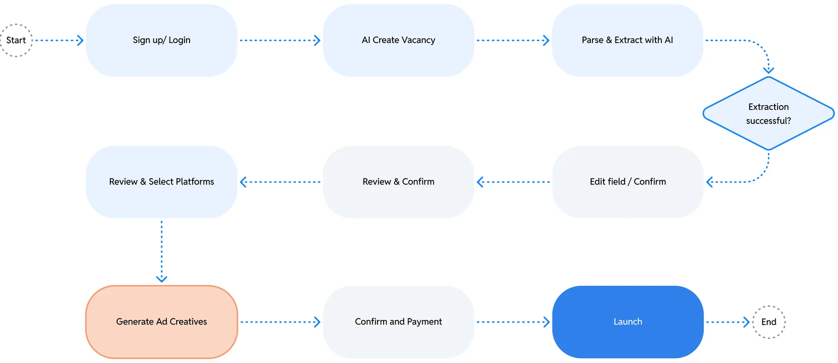
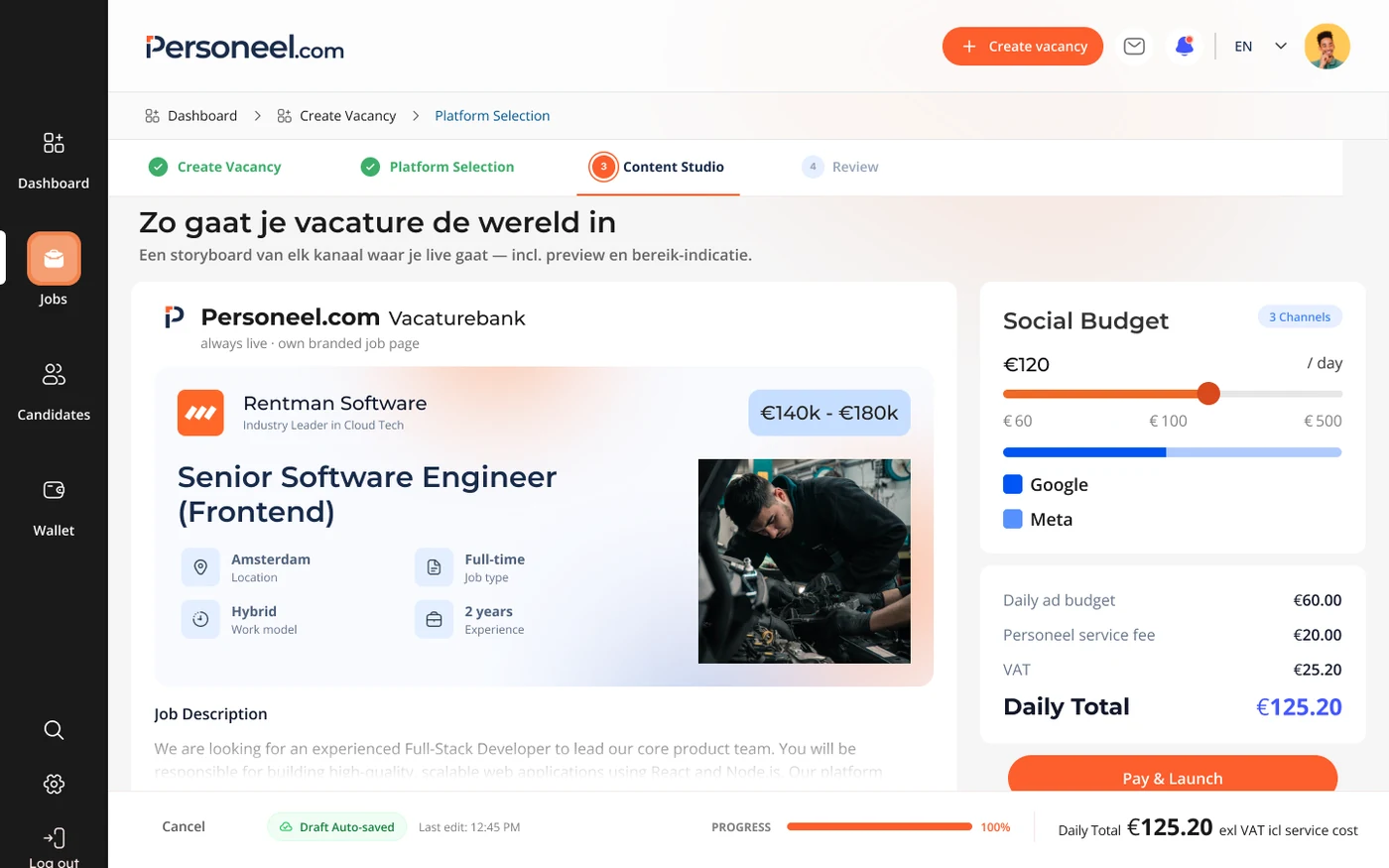
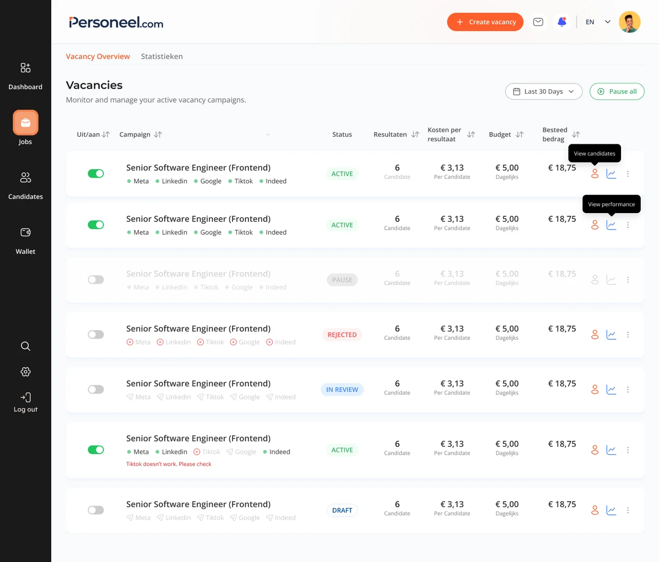
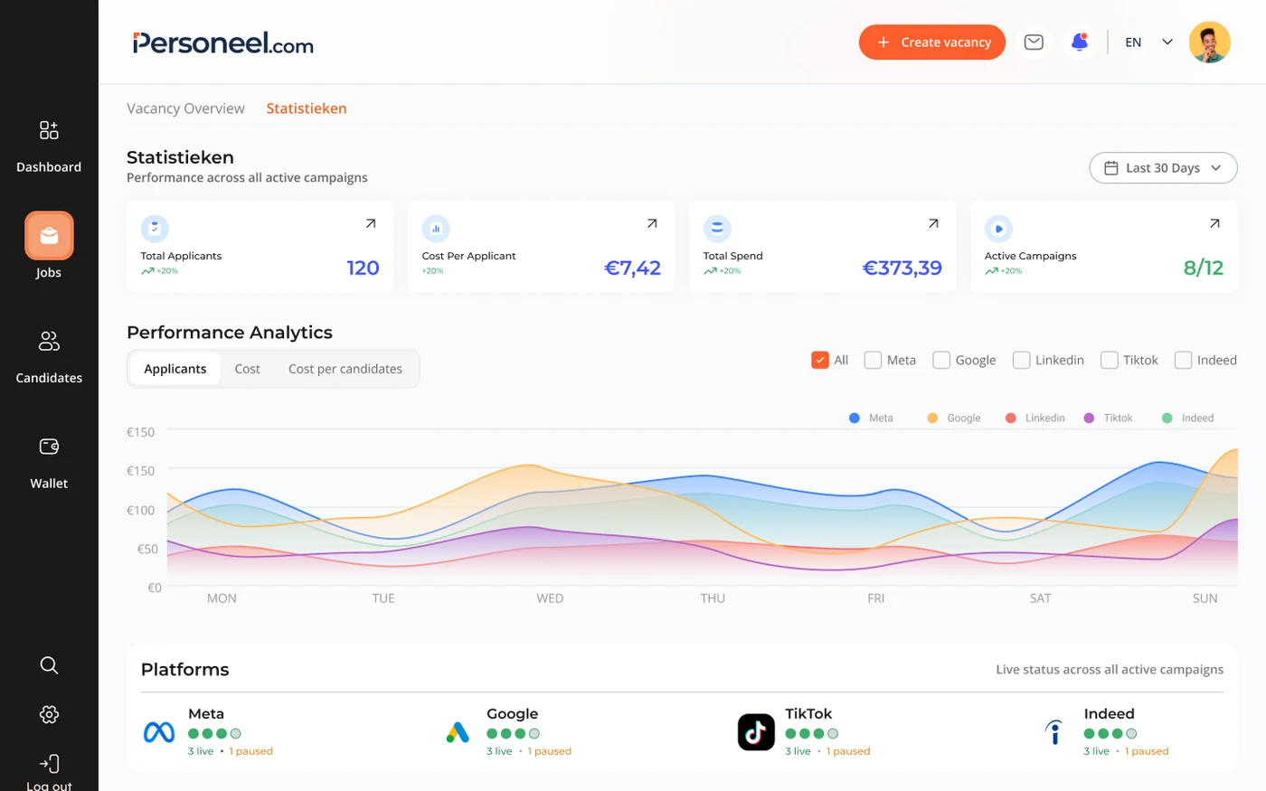
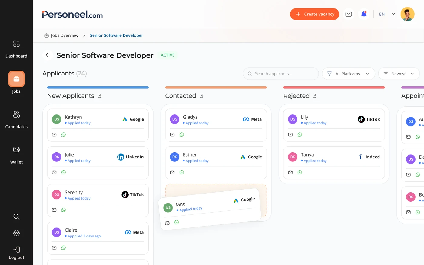
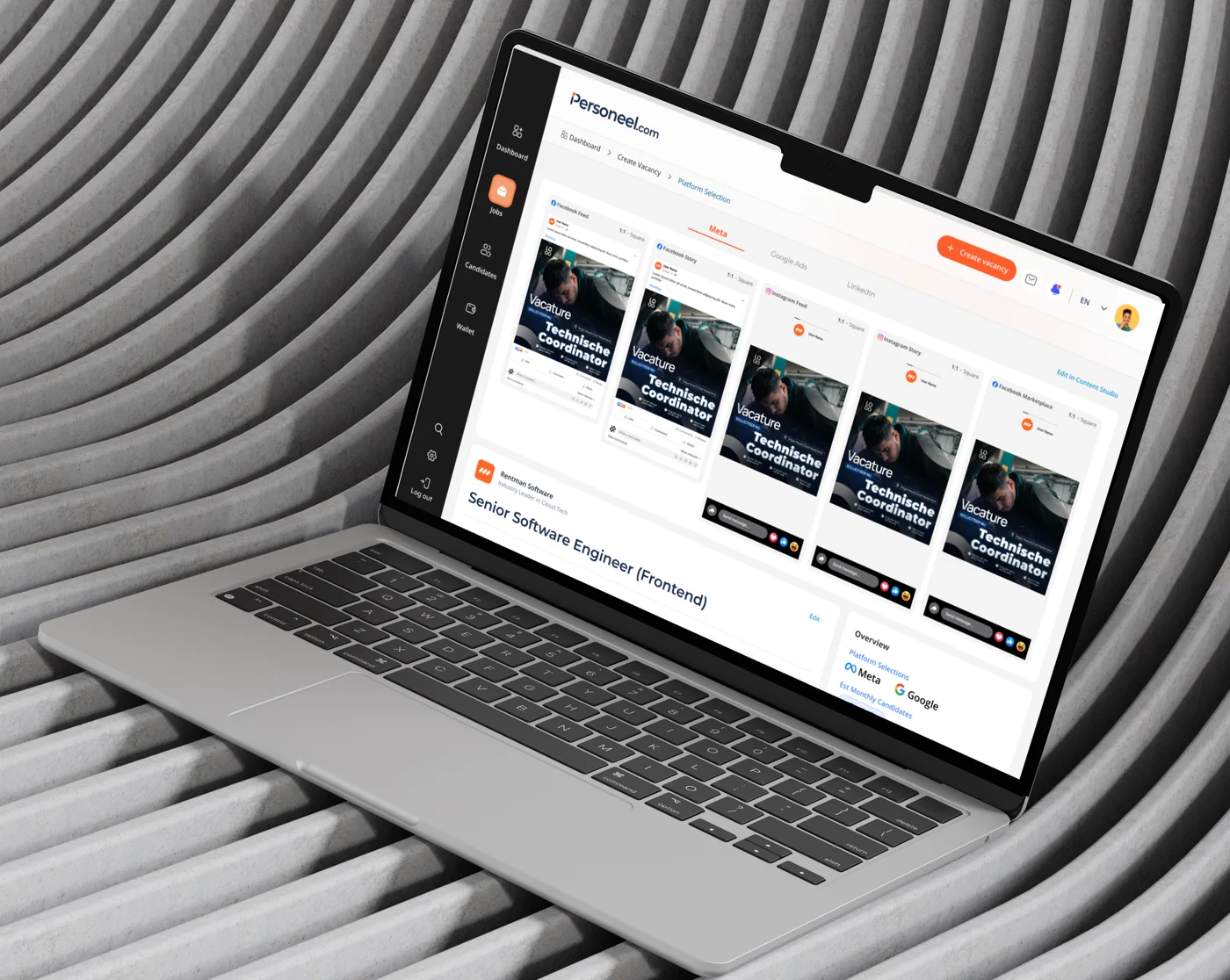
Loading the portfolio

Loading page assets

AI Recruitment
Marketing Platform

Personeel.com is a Dutch AI recruitment marketing platform built for employers who want to run their own ad campaigns across Meta, Google, LinkedIn, and TikTok without relying on expensive recruitment agencies.

Solo-designed an AI recruitment platform. Shipped the MVP in 10 weeks.

Outcome

  • 10-week MVP, end to end
  • 30+ component design system, built from scratch
  • 4–6 hrs of manual setup removed per hire
  • EU AI Act compliant by design

background.

Personeel.com is a Dutch AI recruitment marketing platform built for employers who want to run their own ad campaigns across Meta, Google, LinkedIn, and TikTok without relying on expensive recruitment agencies. The average agency in the Netherlands charges between €8,000 and €12,000 per hire with no guarantee of results. Personeel.com charges a 20% platform fee on ad spend, putting control and cost savings directly in the hands of the employer.

The Gap.

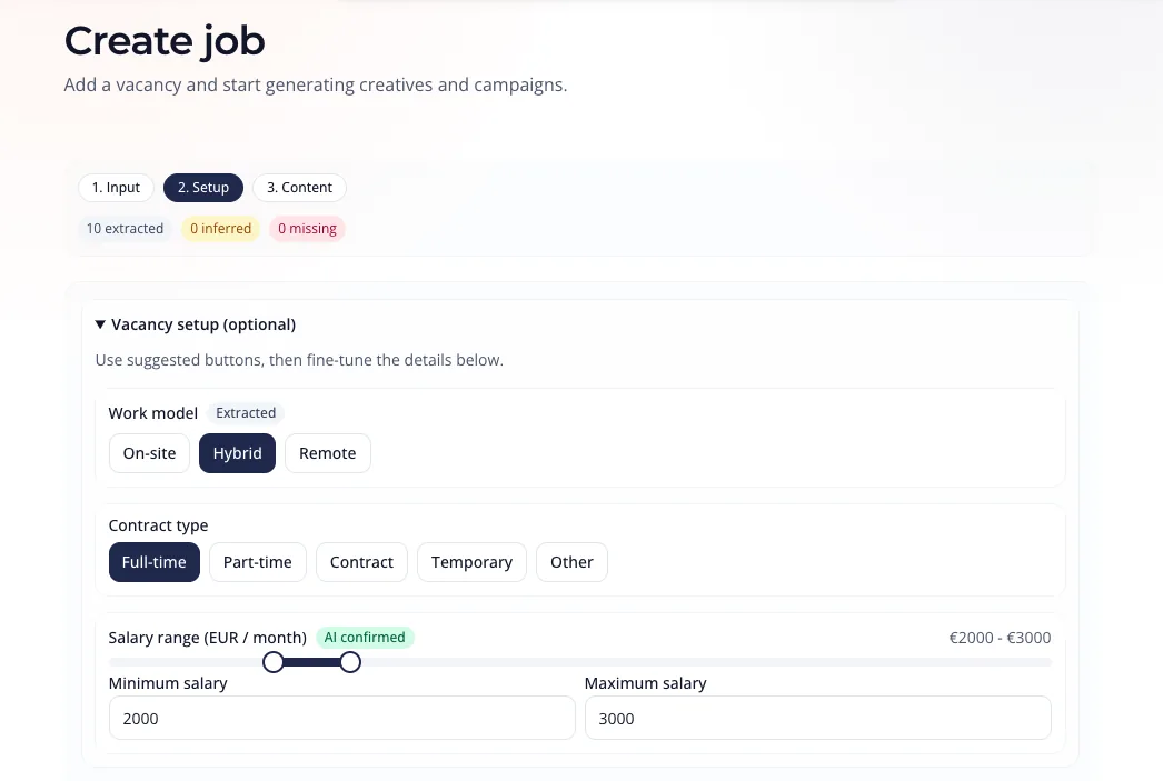
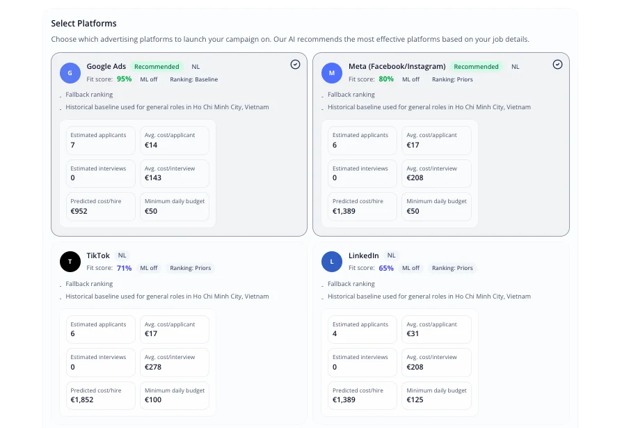
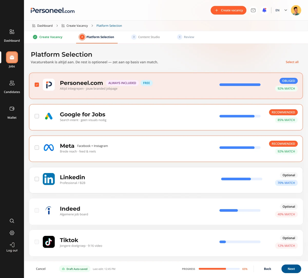
Dutch SMBs spend €8,000–12,000 per hire through recruitment agencies with no guarantee of results. Running ads independently on Meta, Google, and LinkedIn requires marketing expertise most business owners and internal recruiters do not have, and the existing self-serve tools assume a level of knowledge that puts them out of reach.

Goal.

A self-serve AI platform that takes a non-technical employer from job description to live multi-platform campaign in under 15 minutes. Personeel.com replaces five-figure agency invoices with a 20% platform fee on ad spend, distributes ads across Meta, Google, LinkedIn, TikTok, and includes its own job board at no additional cost.

My role.

Sole Product Designer, operating as de facto Product Manager and UX Researcher

Contribution.

  • UX Research
  • UI/Visual Design
  • Compliance Research
  • Prototyping
  • Design System

Meta Info.

  • Platform: Web, desktop-first
  • Status: MVP in progress
  • Timeline: February 2026 to present

Research & Discovery

Before a single screen was designed, I needed to understand three things: what the market problem actually was, who would use the product, and what the people running campaigns manually already knew that had never been written down.

The Market Problem.

The challenge

The Netherlands has 380,000 open vacancies (CBS, Q1 2026), and two-thirds of Dutch entrepreneurs face staff shortages (Conjunctuurenquête Nederland, 2025). The default solution is a recruitment agency at 20 to 25% of gross annual salary, around €12,000 per hire.

67% of SME owners in the Netherlands report recruitment as their top business challenge. The problem is not that talent does not exist but the employers have no accessible way to reach it.

Opportunity

Every existing tool served one of two audiences: HR teams managing candidates who had already applied, or large businesses with marketing departments who knew how to run campaigns independently. The low-complexity, acquisition-focused quadrant was completely empty. No tool had been built for the employer who needed to attract candidates from scratch, without any marketing knowledge, at a cost that made sense for a 20-person business. That was the space Personeel.com was built to own.

Who we designed for

Two distinct user archetypes with fundamentally different needs. Understanding the gap between them was essential, because designing for one without considering the other would have broken the product for both.

The Time-Strapped Owner
Archetype 01The Time-Strapped Owner

A hands-on SME owner running a 20-person garage. He makes fast operational decisions daily, but only within his domain. The moment a tool asks him to configure something outside that domain, he disengages.

Needs and Goals
  • Hire 2 mechanics in <1 month
  • Zero agency dependency
  • Minimum time investment
Painpoints

Agencies charge without guarantees. Complex software wastes time he doesn't have. Being forced to answer questions he has no basis to answer (CPM? targeting?) creates anxiety and distrust, so he abandons the tool.

Motivations

Speed and certainty. René doesn't need to understand how the system works, he needs to trust that it will deliver the result and not bother him with the process. Proof beats explanation every time.

The Proof-Driven Recruiter
Archetype 02The Proof-Driven Recruiter

An internal recruiter managing 25 simultaneous vacancies. She operates complex systems daily (AFAS), is comfortable with data, and carries the dual pressure of filling roles and justifying her value to leadership.

Needs and Goals
  • Close long-open vacancies faster
  • Show measurable ROI to management
  • Own campaigns end-to-end
Painpoints

LinkedIn and Indeed deliver volume without quality. She has no clear performance data to surface in reports. Relying on external agencies undermines her professional credibility, she wants to prove she can run this herself.

Motivations

Autonomy and visibility. Kezia needs a tool that gives her control and produces data she can present upward. Every hire she closes independently strengthens her case against agency spend — and her position in the company.

Account manager Interview

The founding team had been running recruitment campaigns manually for clients before building the platform. Every manual step the AM was performing was either a design requirement, an automation opportunity, or a signal about where users would struggle. Following contextual inquiry methodology (Beyer & Holtzblatt, 1997), I conducted a structured interview with four questions. The answers reshaped the product scope significantly.

Key Insights

The intake was richer than anyone had documented.

The AM was collecting 14 fields per client before a single campaign could launch: hiring goal, job title variations for A/B testing, job benefits, KM radius, salary indication, stock photos, and a Facebook Business Page link.

None of these fields existed in the original Create Vacancy form.

The same two things were missing every single time.

Without exception, every client forgot two things: photos for ad visuals, and their Facebook Business Page link. Most clients either had no business page at all

The upload prompt in Content Studio and the page connection flow in Platform Selection both exist because of this finding.

Hiring speed is a product problem, not just a client problem.

The AM gave every client the same advice: call new candidates within hours, not days. The Dutch labor market moves fast. A candidate who applies on Monday and hears nothing by Wednesday has already accepted another offer.

The design needed to make speed feel easy, not optional.

A high-value automation was hiding inside a manual workflow.

For campaign, the AM was manually building logic inside Meta Business Manager called conditional logic in Meta Forms.

It took hours per client. It was never documented anywhere.

I designed the Must Have section in the vacancy form to include an auto-screen toggle per requirement. An hours-long manual process becomes a single checkbox → This was not in the original brief. It came entirely from the interview.

Product Decisions

Each decision below started with a user or business problem. The design was the output. The thinking was the work.

Flow & Structure

Create Vacancy flow.

Create Vacancy flow: Start → Sign up / Login → AI Create Vacancy → Parse & Extract with AI → Extraction successful? → Edit field / Confirm → Review & Confirm → Review & Select Platforms → Generate Ad Creatives → Confirm and Payment → Launch → End

AI Create Vacancy

How do you make a non-technical employer trust an AI they have never met?

Current state.

No source visibility

Employers filled fields with no way to trace where suggestions came from.

Flat confidence

All extracted values looked identical. Nothing signaled what needed review.

Rigid structure

A fixed step flow forced all users through the same path regardless of what they already knew.

No real-time feedback

No real-time feedback: The candidate-facing output was invisible until the form was complete.

Create job — vacancy setup screen showing extracted fields, work model, contract type, and salary range

Improved flow.

Bidirectional source tracing

Every field traces back to the exact source text that generated it. EU AI Act compliant by design.

Five-level confidence system

AI DETECTED to NEEDS REVIEW guides attention to what needs human judgment. Cognitive effort matches real uncertainty.

Adaptive split-screen

Source Document and Vacancy Preview switchable on the left. Resizable panel adapts to individual workflow.

Reduced cognitive load

AI pre-fills, grouped sections, and inline benchmarks let employers review instead of build from scratch.

Improved Create Vacancy editor — split-screen with Source Document / Vacancy Preview, AI-detected fields, and confidence states

Platform Selections

Current state.

No recommendation logic

Platforms were listed equally with no signal about which was most suitable. Users saw the same 4 options with the same visual weight.

No selection state

Users had no way to see which platforms were active or understand why one might outperform another for their specific role.

Hidden costs

Total spend required manual calculation. No summary, no monthly estimate, no baseline comparison before committing.

Missing free value

The Personeel.com job board, included at no cost, was not surfaced as part of the platform decision at all.

Select Platforms — Google Ads, Meta, TikTok and LinkedIn cards with fit scores, estimated applicants and costs

Improved flow.

AI-driven match scoring

Each platform receives a fit score based on role category and location. A hospitality role scores 95% on Meta. Recommended platforms are toggled on by default. Users override, not decide from scratch.

Redesigned Platform Selection — Personeel.com always included, Google for Jobs and Meta recommended with match scores, plus optional LinkedIn, Indeed and TikTok

Content Studio

A single campaign could produce over a thousand possible ads across five platforms, multiple aspect ratios, templates, and copy variants. Choice overload research (Iyengar & Lepper, 2000) confirms what intuition suggests. The design problem was not how to generate variants. It was how to make the volume reviewable within human cognitive limits.

The power user dashboard.

The first version exposed every control at once. Internal testing showed users were overwhelmed before they began. Aspect ratio concepts meant nothing to non-marketing users. The upload paradigm required preparation that contradicted the AM Interview finding about forgotten photos. René would never start. The version did not ship.

Content Studio iteration 1 — power-user dashboard exposing every ad control at once

Review Page before Launch

The final checkpoint before a recurring daily charge begins. A storyboard preview shows the vacancy as it will appear on each channel, so employers see what they are buying. The cost panel breaks price into named line items (ad budget, service fee, VAT, daily total) as required by EU Price Indication Directive, nothing hidden until checkout. And the free Vacaturebank is separated from paid social budget, so included value is never confused with billed spend.

Review before launch — storyboard preview of the vacancy with an itemized social budget panel (daily ad budget, service fee, VAT, daily total) and Pay & Launch

A single dashboard to monitor every live campaign. This screen shows status, results, cost per result, budget, and spend in one scannable row. Status surfaces at both campaign and platform level, so when one channel fails ("Tiktok doesn't work. Please check") it shows inline instead of hiding behind an "Active" label

Vacancies Overview dashboard — campaigns with status, results, cost per result, budget and spend, plus inline platform-level failure messages

Usability Testing

We tested the end-to-end flow with two external users: Bart, 25, semi-technical, and Guido, 21, a restaurant staff. Both recorded think-aloud sessions. Neither could publish.

Bart, 25 - semi-technical

Image upload: forced to add 32 images one by one, bulk upload failed

Guido, 21 - restaurant staff

Google Ads validation: stayed red, no explanation of what was missing

Root Cause

Asset & visual handling

Redesign Result

Content Studio

AI curator, bulk upload, AI-first generation

Key Results

Different screens, same wall

Bart stalled at image upload, adding 32 images one by one after bulk upload failed. Guido could not turn Google Ads validation green, with no message explaining what was missing. Both pointed at one root cause: asset and visual handling. This drove the Content Studio redesign to the AI curator.

Bugs and UX are not one list

I split findings by owner. Bugs need engineering: silent account-creation failures, unresponsive selectors, hidden CTAs. UX problems need design: a “decklayer10” label exposed in production, eight required headlines with no reason, a “95% match” score that pushed Bart to one channel.

What I learned

Both users praised the AI job description extraction; the failures sat in asset handling, not the AI core. The deeper lesson: this was a product guidance problem, not a UI one. Internal testers route around gaps using context they already have. External users carry none, which makes them the honest signal.

outcome.

Personeel.com launched as a self-serve recruitment marketing platform that lets a non-technical business owner go from job description to live multi-platform ad campaign. The full MVP shipped in 2.5 months covering authentication, vacancy creation, platform selection, content studio, launch and payment, candidate pipeline, and a complete design system with 30+ components.

Takeaways.

Impact.

7 missing form fields discovered through AM interview alone, preventing drop-off at step one. 4 to 6 hours of manual Meta campaign setup eliminated per client via the auto-screen toggle. Flow completable in under 5 minutes in internal walkthroughs with non-technical team members.

What I learned.

Designing without a PM is a research problem, not a design problem. The most valuable work I did on this project was structuring the AM interview before designing. The questions I asked determined the product decisions that followed. Progressive disclosure is a business strategy, not just a UX pattern. Trust is built in details, not in features. Edge cases are product decisions. Payment failures and ad rejections forced policy conversations that would otherwise have surfaced in production.

Next steps.

Post-launch validation.

Usability testing with 5 participants per persona on Create Vacancy and Platform Selection. Validate KPIs and update this case study with real conversion data.

Phase 2 automation.

Full auto-screen integration between Must Have requirements and Meta Instant Forms. Highest-value automation found in research. Clearest operational impact on AM time per campaign.

Personeel.com — closing banner